
Getting Seasonal Colour Right When Your Undertone Doesn't Match the Palette of the Moment

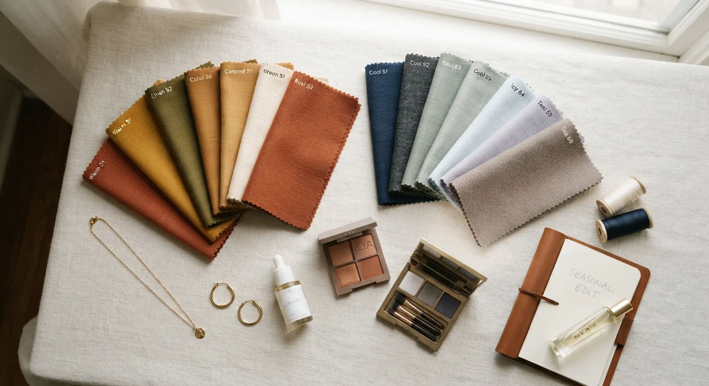
Photo: UnlockTopics.com | Unlocking Trending Content editorial
Key Takeaways
- Your skin's undertone — warm, cool, or neutral — affects how seasonal colours read against your complexion.
- You don't have to skip a trend entirely; strategic placement can make almost any colour work.
- Accessories, prints, and layering are lower-risk entry points for challenging hues.
- Identifying your personal neutrals lets you anchor trend colours without overpowering your colouring.
- Seasonal colour forecasts are starting points, not rules — adaptation is part of the process.
Why Seasonal Palettes Don't Always Translate
Each season, trend authorities release colour forecasts that ripple out from runway collections to the high street. Understanding how those palettes are set is useful context — because they are built around cultural mood and aesthetic direction, not around the full spectrum of human skin tones.
The result is predictable: a season dominated by, say, cool lilacs and icy blues will flatter people with pink-toned or neutral undertones but can read muddy or washed out against golden, olive, or deep warm complexions. The inverse happens when earthy terracottas and mustard yellows take centre stage. Neither group needs to opt out of the trend — they just need a different entry point.
The first task is confirming your own undertone category. Warm undertones tend toward golden, peachy, or yellow hues; cool undertones lean pink, red, or bluish; neutral undertones fall somewhere in between and have the most flexibility. Vein colour (greenish suggests warm, bluish-purple suggests cool), how your skin responds to sun, and which metal tones — gold or silver — look most harmonious against your skin are all reliable informal indicators.
Neutral Undertones Have the Most Flexibility
How to Work With — Not Against — the Season's Palette
Once you know where your undertone sits, the following steps walk you through adapting any seasonal palette to your colouring. The goal isn't to avoid the season's colours but to find the version of them that works for you.
Identify the season's hero colours and note their undertone
Pull up the season's key shades — from editorial coverage, retailer lookbooks, or trend roundups — and assess each one. Is it a warm, yellow-based red or a cool, blue-based red? A warm camel or a cool greige? Every colour has its own undertone, and identifying it tells you immediately how it may interact with your complexion.
Find the closest flattering variant within that colour family
Most seasonal colours exist on a spectrum. If the moment's olive is too yellow for your cool undertone, look for a cooler, more muted sage. If the trending dusty rose feels washed out against a warm complexion, a terracotta-rose or deeper mauve in the same pink family often reads better. Work within the colour family rather than abandoning the trend entirely.
Decide on placement: face-adjacent vs. away from the face
Where a colour sits on the body matters enormously. Colours close to your face — in a top, scarf, or collar — have the greatest impact on how your complexion appears. Moving a difficult shade to the lower half of an outfit (trousers, a skirt, shoes) lets you participate in the trend while keeping a more flattering tone near your face.
Use accessories as a low-commitment entry point
Bags, belts, shoes, jewellery, and even nail colour are the lowest-risk vehicles for seasonal hues. They signal engagement with the trend without requiring a flattering colour to sit anywhere near your face. This is particularly useful for colours that look strong in isolation but unpredictable against your skin — bright chartreuse, for example, works well as a bag when it would overwhelm as a blouse.
Adjust makeup to bridge the gap
When you want to wear a challenging colour close to the face, makeup is one of the most effective corrective tools available. A bronzer or warm blush can counteract the cooling effect of an icy-toned top on a warm complexion; a cool-toned highlighter or berry lip can help balance an earthy, warm-toned outfit against a cool complexion. Think of makeup as part of the colour story, not separate from it.
For readers who enjoy deeper exploration of how colour relationships function in an outfit context, the principles behind colour blocking and tonal dressing apply directly here — tonal approaches in particular are forgiving when a hero colour is challenging.
Trend Palettes Are Rarely One-Size Colours
Using Neutrals and Prints as a Bridge
One of the most practical tools for navigating a tricky seasonal palette is a strong neutral foundation. A well-chosen neutral base lets you introduce even the most demanding trend colours in smaller doses — as a belt, a scarf, or a shoe — without the hue dominating your face or overall silhouette.
Prints offer a similar buffer. When a seasonal colour appears inside a pattern alongside hues that do flatter you, your eye blends the combination. Making seasonal prints work together is a useful extension of this thinking. The print effectively mediates between the trend and your undertone.
If trend fatigue is part of the picture — if chasing every seasonal shift feels exhausting — a more selective approach to seasonal colour often produces a more coherent wardrobe anyway. Choosing one or two pieces in a modified version of the season's palette, anchored by timeless personal neutrals, is a considered strategy rather than a compromise.
The content on this site is for informational purposes only and is not a substitute for professional advice. Always consult a qualified professional for guidance specific to your situation.