
The Neutral Colour Palette: Why It Anchors a Functional Wardrobe

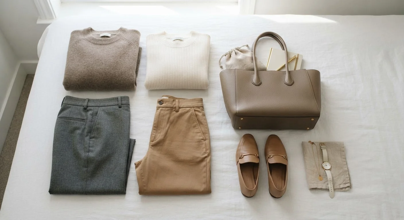
Photo: UnlockTopics.com | Unlocking Trending Content editorial
Key Takeaways
- Neutral tones maximise outfit combinations by working across most colour pairings.
- There are two categories: true neutrals (black, white, grey) and near-neutrals (camel, navy, taupe).
- Warm and cool neutrals can clash — identifying your dominant undertone helps build a cohesive palette.
- A neutral-anchored wardrobe supports both tonal dressing and accent-colour styling.
- Neutral foundations reduce decision fatigue and make seasonal trend pieces easier to incorporate.
What Makes a Colour 'Neutral'?
The term neutral in fashion is used more loosely than it is in colour theory, but the core principle holds: these are tones that do not dominate a composition. True neutrals — black, white, and the full grey spectrum — are technically achromatic, meaning they carry no measurable hue. Near-neutrals like camel, taupe, navy, ivory, and warm brown have a hue component, but it is muted enough that they behave like neutrals in practice.
What distinguishes neutrals from other colours is their low visual assertiveness. They recede rather than demand attention, which is precisely why they function so effectively as foundations. A camel coat does not compete with a printed blouse underneath it; a slate-grey trouser sits quietly beneath almost any top. This quality makes neutral pieces inherently more versatile than their saturated counterparts.
Navy: A Near-Neutral Worth Understanding
The Undertone Problem: Warm vs. Cool Neutrals
Not all neutrals mix seamlessly with each other — and understanding why is one of the most practically useful lessons in wardrobe building. Most neutrals carry a subtle undertone that reads as either warm (yellow, red, or orange-based) or cool (blue or green-based).
Warm neutrals include camel, ivory, warm beige, chocolate brown, and off-white with a yellow cast. Cool neutrals include bright white, slate grey, navy, charcoal, and taupe with a grey undertone. Mixing pieces from opposite ends of this spectrum without intention — say, a crisp cool-white blouse tucked into warm cream trousers — tends to read as an accidental mismatch rather than a deliberate styling choice.
A practical strategy is to identify your wardrobe's dominant undertone and build around it. This does not mean strict rules; editorial dressing regularly pairs warm and cool neutrals. But knowing which neutrals anchor your existing pieces makes it easier to add new ones that integrate rather than fragment. For a deeper look at how skin undertones interact with colour choices, see how to work with seasonal colours when your undertone differs.
Test Your Neutrals in Natural Light
Why Neutrals Anchor a Functional Wardrobe
A wardrobe built on a neutral foundation solves one of the most common everyday friction points: outfit-building dead ends. When core pieces — trousers, blazers, knitwear, outerwear — exist in neutral tones, they can be combined with almost anything else in the wardrobe. This dramatically multiplies the number of viable outfits from the same number of items.
Neutrals also make trend pieces easier to absorb. When a bold seasonal colour or a statement print enters the rotation, a neutral-anchored wardrobe provides an instant context for it. Rather than requiring a whole new outfit ecosystem, the new piece simply slots in. For context on how trend forecasters set those seasonal palettes in the first place, understanding the colour forecast offers useful background.
70–80%
Core wardrobe pieces typically in neutral tones
A commonly cited framework in capsule wardrobe methodologies suggests most foundational pieces — those worn most frequently — should sit in neutral or near-neutral tones to maximise outfit flexibility.
3–5
Anchor neutrals needed to build a functional base
Style educators frequently suggest that a starting neutral palette of three to five anchor tones — such as black, white, grey, camel, and navy — is sufficient to support a versatile core wardrobe before expanding.
This anchoring function also reduces decision fatigue — a well-documented consequence of high-choice environments. When each piece connects predictably to many others, getting dressed becomes a lower-effort, higher-confidence task. The foundational wardrobe pieces that appear across most functional wardrobes are, not coincidentally, overwhelmingly neutral in colour.
Building and Expanding a Neutral Palette
Starting a neutral wardrobe does not mean replacing everything at once. A more practical approach is to audit existing pieces by undertone, identify gaps, and fill them deliberately. A common starting framework includes: one true black piece, one white or ivory piece, one mid-grey, one warm neutral (camel or beige), and one deeper neutral (navy or charcoal). From there, the palette expands based on the specific gaps in your wardrobe's outfit-building logic.
Once a neutral foundation is in place, the question becomes how to work with or contrast it using colour. Two distinct approaches — colour blocking and tonal dressing — offer very different answers to this, and both use neutrals differently. Tonal dressing often means pulling the neutrals into a single-hue story; colour blocking uses neutrals to frame or rest between saturated zones.
For those building seasonally, a neutral base also makes wardrobe rotation more intelligent. Pieces that work across seasons by virtue of being tonally versatile are the most cost-effective to own. The capsule dressing by season framework explores this rotation logic in practical detail.
Frequently Asked Questions
The content on this site is for informational purposes only and is not a substitute for professional advice. Always consult a qualified professional for guidance specific to your situation.