
The Colour Forecast: Understanding How Trend Authorities Set Seasonal Palettes

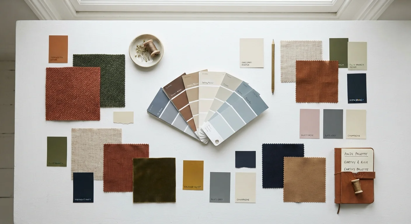
Photo: UnlockTopics.com | Unlocking Trending Content editorial
Key Takeaways
- Colour forecasts are produced 12–24 months before a season, long before products hit the shelves.
- Specialist trend agencies, not individual designers, drive the initial palette predictions.
- Cultural events, art, travel, and consumer sentiment all feed into colour forecasting decisions.
- Retailers translate forecasts into accessible ranges at multiple price points simultaneously.
- Understanding the system helps you shop more intentionally rather than reactively chasing trends.
- Timeless neutrals remain viable regardless of which seasonal hues dominate any given forecast.
Where Seasonal Palettes Come From
Walk into any clothing store at the start of a new season and a subtle but unmistakable theme emerges — an earthy terracotta here, a moody cobalt there, all somehow feeling coordinated. That coherence is not accidental. It is the downstream effect of a formalised colour forecasting industry that operates years upstream of what you see on the rack.
The process starts with a small ecosystem of trend-forecasting agencies whose core business is cultural observation. Researchers track shifts in art exhibitions, film releases, street photography, travel destinations, and even political and environmental events — any signal that might indicate a collective emotional mood. Those observations are synthesised into directional palettes, which are then sold as subscription services to brands, manufacturers, and retailers.
Trade fairs play an equally important structural role. Events such as Première Vision in Paris (focused on textiles) set the physical standard for colour in fabric before designers begin sketching. Dye and yarn manufacturers attend, adopt the agreed palettes, and begin producing materials — which means the colour direction is effectively locked into the supply chain before a single runway show takes place. For anyone wanting to understand how style trend terminology connects to these behind-the-scenes systems, the language of forecasting is a useful place to start.
The Key Institutions Behind the Forecast
Several organisations carry particular weight in shaping seasonal colour narratives. The Pantone Color Institute, perhaps the most publicly recognised, produces an annual Color of the Year and seasonal palettes that function as cultural shorthand across both fashion and interior design. The institute draws on a wide range of inputs — from entertainment and social media to consumer wellbeing research — to identify what it describes as the mood of the moment.
Forecasting services like WGSN and Trend Union operate primarily B2B (business-to-business), meaning their reports are purchased by brand teams, not individual consumers. These agencies often publish competing palettes for the same season, which is why the industry tends to converge on a cluster of related hues rather than a single universal colour.
18–24 months
Typical lead time for colour forecasts before retail
Industry-standard forecasting timelines cited by major trend agencies including WGSN and Pantone Color Institute.
3–6 months
Fast-fashion lead time from runway to rack
Fast-fashion retailers compress the traditional forecasting timeline by reacting to published runway imagery rather than long-range trend data.
Multiple industries
Sectors that share the same seasonal colour forecasts
Fashion, beauty, automotive, interior design, and packaging industries all reference cross-sector forecasting bodies like the Color Marketing Group.
Colour forecasting also intersects with the world of interior design through organisations like the Color Marketing Group, a US-based trade association that brings together colour specialists from multiple industries to develop forecasts collaboratively. This cross-industry overlap is why a trending fashion hue — say, a sage green or a dusty rose — frequently appears simultaneously in homeware and beauty as well.
From Forecast to High Street: The Trickle-Down Timeline
The journey from abstract cultural observation to a garment on a mid-market store's rail involves multiple translation steps. Luxury designers engage with forecasting data earliest, interpreting predicted palettes through their own aesthetic and crafting runway collections that further amplify certain colours. When those shows are covered in the press, the palette gets its second, highly public round of endorsement.
Ready-to-wear and contemporary brands watch the runways and begin adapting those colour signals for their own customers — moderating the most directional shades into wearable variations. By the time a trend reaches mass-market and fast-fashion retailers, it has been reviewed, filtered, and re-contextualised several times over.
Shop the Trend at Low Commitment
This is why the same broad seasonal colour story feels accessible at multiple price points simultaneously. It also explains why, if you feel overwhelmed by trend cycles, that instinct is well-founded — the system is deliberately designed to create a sense of momentum. Trend fatigue is a real and recognised phenomenon, and understanding the mechanics behind it is the first step to engaging with colour on your own terms.
Using Colour Forecasts Without Being Controlled by Them
Knowing how the system works gives you a more deliberate relationship with seasonal colour. Rather than treating forecast hues as obligations, consider them as a curated menu — you can sample selectively without ordering the full set.
A practical framework: anchor your wardrobe in a foundation of well-chosen neutrals that remain relevant regardless of which seasonal palette is dominating any given year. The neutral colour palette as a wardrobe anchor is a concept worth understanding before committing to any trend purchase. From that foundation, a single trending accent colour — introduced through an affordable or lower-commitment piece — allows you to participate in a seasonal moment without overhauling your closet.
Before any seasonal shopping, a structured wardrobe audit helps clarify exactly what colour gaps, if any, actually exist in your existing collection. The goal is intentional addition rather than reactive accumulation — which is ultimately what separates considered style from trend-chasing.
Frequently Asked Questions
The content on this site is for informational purposes only and is not a substitute for professional advice. Always consult a qualified professional for guidance specific to your situation.