
Pattern Mixing in Practice: Making Seasonal Prints Work Together

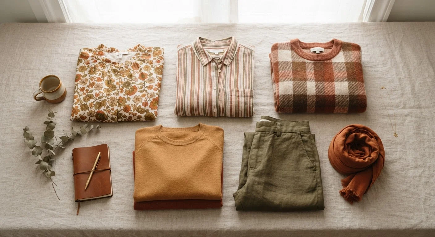
Photo: UnlockTopics.com | Unlocking Trending Content editorial
Key Takeaways
- Scale contrast — pairing a large print with a small one — is the most reliable way to prevent visual chaos.
- A shared color thread between two patterns acts as the visual glue that makes the combination read as intentional.
- Mixing pattern families (florals with geometrics) typically works better than stacking two patterns of the same type.
- Seasonal prints follow color logic; anchoring mixed prints to the season's palette keeps outfits feeling cohesive.
- Solid-colored pieces can act as visual rest points between two competing prints.
Why Pattern Mixing Has Rules — and Why They're Not Restrictions
The idea that prints should never share an outfit is one of fashion's most persistent myths. As explored in style rules that aren't actually rules, many of the so-called laws of dressing have more to do with outdated convention than with genuine visual logic. Pattern mixing, done well, follows the same principles as any good composition: contrast, proportion, and a common thread.
The deeper mechanics — how scale relationships and color proximity determine whether two prints harmonize or clash — are covered in the logic behind outfits that shouldn't work but do. This guide focuses specifically on the seasonal dimension: how to make prints work together when they're drawn from trend-driven collections rather than your year-round wardrobe staples.
Start With Color, Not Pattern
Seasonal prints carry their own built-in palette logic. Florals in spring collections tend to share a warm, slightly muted base; autumn prints cluster around earthy, saturated tones. That shared tonal temperature is a starting point — not a guarantee, but a meaningful advantage when you're building a mixed-print outfit around current pieces.
What you will need
What to Do and What to Watch For
The six steps below give you a repeatable process for evaluating any two-print combination before you commit to wearing it. They apply whether you're mixing a transitional-season floral with a classic stripe or pairing two trend-driven prints from the same collection. For more on how fabric and texture interact with pattern choices across the calendar, autumn textures versus spring fabrics is worth reading alongside this guide.
Full-length mirror
Allows you to assess the full visual impact of the mixed-print outfit from head to toe before committing.
Color swatch or reference card
Helps identify shared colors between two prints, especially useful for subtle tonal overlaps.
Solid-colored layering piece
Acts as a visual buffer between two competing patterns to balance the overall outfit.
Identify the dominant colors in each print
Lay both patterned pieces side by side in natural light. Note the one or two colors that carry the most visual weight in each. You're looking for a shared color — even a neutral like cream, camel, or navy — that can serve as a unifying thread. This shared hue is what tells the eye the combination is intentional.
Compare the scale of the two prints
Hold the pieces together and assess the relative size of each pattern's repeat. A large floral paired with a fine stripe creates productive tension; two mid-scale prints of similar size create visual noise. If both patterns feel similarly sized, consider whether one can be styled so less of it is visible — tucking a blouse, for example, reduces its visual footprint.
Check the pattern families
Pattern families fall into broad categories: organic (florals, botanicals, animal prints), geometric (stripes, checks, houndstooth, plaid), and abstract (watercolor, graphic, painterly). Mixing across families — a floral with a stripe, a check with a botanical — tends to work more naturally than doubling up within the same family. Two stripes or two florals require more precision to resolve, since they share the same visual rhythm.
Anchor the combination to the season's color palette
Seasonal palettes — whether the warm ochres and burgundies of autumn or the dusty botanicals of spring — create a natural framework for print mixing. When both prints draw from the same seasonal palette, they share a tonal temperature that makes them feel like they belong together. For guidance on how trend authorities shape those palettes, see how seasonal color forecasts work.
Introduce a solid piece if needed
If the two prints feel busy together, add a solid-colored piece in a color drawn from both prints. A blazer, wide-leg trouser, or even a belt in a neutral that appears in each pattern creates breathing room without neutralizing the intentional layering. This technique also lets you carry bold patterns into more restrained settings.
Evaluate the full outfit in a mirror
Step back and assess the complete look from a distance of at least six feet. Your eye should move fluidly between the two prints rather than snagging on one. If one pattern is visually overwhelming the other, try rebalancing by exposing less of it — tuck, layer, or swap it for the solid buffer. The goal is a considered, dynamic tension, not an equal fight for attention.
Use a Solid as a Buffer Piece
Once you've built confidence with two-print combinations, the same principles scale to three. The key is maintaining one dominant pattern, one secondary pattern at a smaller scale, and one solid anchor — a structure that maps directly onto a well-edited seasonal wardrobe. For a broader framework on rotating prints and patterns across seasons without accumulating redundant pieces, see capsule dressing by season.
Avoid Matching Scale Too Closely
The content on this site is for informational purposes only and is not a substitute for professional advice. Always consult a qualified professional for guidance specific to your situation.