
Pattern Mixing: The Logic Behind Outfits That Shouldn't Work but Do

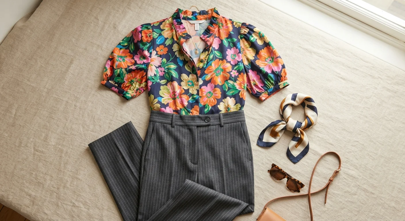
Photo: UnlockTopics.com | Unlocking Trending Content editorial
Key Takeaways
- Varying the scale of patterns is the single most reliable technique for successful mixing.
- A shared colour between two prints creates visual harmony even when the patterns differ dramatically.
- Limit most mixed outfits to two or three patterns to maintain coherence.
- Solid pieces act as visual rest stops and help anchor busier pattern combinations.
- Pattern mixing is a learnable skill governed by proportion and colour logic, not intuition alone.
Why Pattern Mixing Looks Either Brilliant or Chaotic
The difference between a deliberately styled mixed-print outfit and a visual collision usually comes down to three factors: scale, colour relationship, and the ratio of pattern to solid. These aren't subjective style instincts — they're compositional principles the same way balance and contrast are in graphic design.
Pattern mixing is sometimes dismissed as a rule-break, but as we explore in Style Rules That Aren't Actually Rules, many fashion 'rules' are actually heuristics — shorthand for more nuanced principles. 'Never mix prints' is one of them. What the rule is really protecting against is the chaos that results when patterns compete at the same scale, in clashing colours, without visual anchoring. Address those three variables correctly and the rule becomes irrelevant.
Understanding how pattern mixing connects to colour theory is also useful. If you already think carefully about how colours interact in an outfit — see our piece on colour blocking vs. tonal dressing — you'll find that mixed patterns layer naturally on top of that thinking.
What You'll Need Before You Start
What you will need
Full-length mirror
Allows you to assess the full visual impact of combined patterns from a distance, which changes how scale and proportion read.
A neutral solid piece (white shirt, black trousers, beige knit)
Acts as a visual buffer between two patterns or grounds a louder combination, making it easier to test how patterns interact.
Colour wheel or colour reference app
Helps identify shared undertones or complementary hues between two patterns when the relationship isn't immediately obvious.
The Step-by-Step Logic
Identify the scale of each pattern
Lay or hang the two pieces you want to combine side by side. Assess the visual 'density' of each pattern — is it a bold, large-repeat print (oversized florals, wide stripes, large plaid) or a small, fine-repeat print (micro-stripe, tiny polka dot, fine houndstooth)? Patterns at different scales — one large, one small — are far easier to combine than two patterns at a similar scale, which tend to visually compete and create optical noise.
Find the shared colour thread
Look for at least one colour that appears in both patterns — even a secondary or background colour counts. This shared hue is what creates the visual logic that makes mixed prints feel deliberate rather than accidental. A red floral and a red-and-white stripe read as intentional even though the patterns couldn't be more different. If there's no overlap, consider adding a solid accessory or layer in a bridging colour.
Set a pattern-to-solid ratio
Decide how much of the outfit will be patterned vs. solid. For most people starting out with pattern mixing, a two-to-one ratio works well: two patterned pieces supported by at least one strong solid — a belt, a shoe, an outerwear layer, a bag. The solid gives the eye somewhere to pause and prevents the overall look from feeling overwhelming. As your confidence grows, that ratio can shift, but anchoring with some solid is almost always useful.
Consider pattern type variety
Beyond scale, varying the type of pattern makes combinations work better. Geometric patterns (stripes, checks, grids) and organic patterns (florals, abstract, paisley) coexist well precisely because they're structurally different — the eye reads them as separate systems rather than fighting versions of the same thing. Two geometric prints or two florals need more careful scale and colour calibration to avoid looking unintentional.
Assess at distance and adjust
Put the outfit on and step back — at least two to three metres from a mirror. Mixed patterns behave differently at distance than they do up close. What looks like a clear scale difference when you're holding the pieces might compress into a similar visual weight when viewed as a complete outfit. Adjust by swapping one element, adding a solid layer, or changing the proportion of what's visible (tucking a shirt changes how much of each print shows).
Start With a Pattern You Already Love
Pattern Mixing Isn't a Licence to Ignore Fit
Making It Work Long-Term
Pattern mixing becomes intuitive once you've practised the underlying logic a few times. The goal isn't memorising combinations — it's training your eye to read scale, colour, and density quickly. Stand back from the mirror after dressing: if the eye moves easily across the outfit without snagging, the proportions are likely working. If it feels noisy or exhausting, the patterns are probably too similar in scale or competing for the same tonal space.
Proportion is a recurring theme across many styling decisions. The same sensitivity that helps you balance pattern visual weight also applies to silhouette — if you want to go deeper on that, the principles behind proportional dressing is a useful companion read. And if you find your mixed-pattern outfits still feel slightly off even when the patterns seem compatible, the culprit may be something else entirely — common styling missteps are explored in why outfits fall flat.
Pattern mixing also responds to seasonal context. Some print combinations feel distinctly warm-weather (tropical florals with open weave stripes) while others read as cooler months (plaid with fine houndstooth). Keeping an eye on seasonal trend context helps you pull combinations that feel current rather than arbitrary.
The content on this site is for informational purposes only and is not a substitute for professional advice. Always consult a qualified professional for guidance specific to your situation.