
How Retailers Use Store Layout and Packaging to Influence What You Reach For

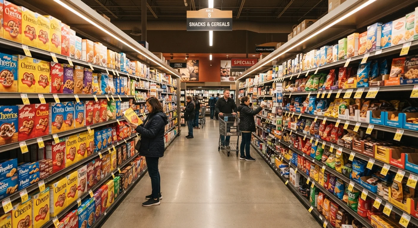
Photo: UnlockTopics.com | Unlocking Trending Content editorial
Key Takeaways
- Eye-level shelves are prime real estate - products placed there receive the most shopper attention.
- Packaging colour, size, and typography are tested to trigger specific emotional responses.
- Store layouts are designed to maximize time spent in high-margin sections.
- Recognizing these tactics gives you more deliberate control over your purchasing decisions.
- End-of-aisle displays and checkout zones are high-pressure zones engineered for impulse purchases.
The Store as a Designed Experience
Walking into a well-organized retail store feels intuitive, even pleasant. That ease isn't accidental - it's the result of deliberate planning by store designers, brand managers, and consumer research teams. Every element, from the width of the aisles to the height of the shelving, is calibrated to keep you engaged and moving through specific sections in a specific order.
Most large grocery and home goods stores use a counterclockwise traffic flow, which aligns with the natural tendency of right-handed shoppers to turn left. High-margin departments - fresh produce, bakeries, floral sections - are often placed near the entrance, where their sensory appeal (colour, scent, freshness) sets a positive tone for the rest of the trip. Meanwhile, staple items are tucked toward the back, ensuring you pass through more of the store to reach them.
Understanding this designed environment doesn't make you immune to it, but it does shift the power dynamic slightly. When you recognize a layout choice for what it is, you're better positioned to decide whether to follow it or not. For a broader framework on separating genuine household needs from incidental purchases, see this guide to needs vs. wants vs. nice-to-haves.
~70%
In-store purchase decisions made on the spot
Research from the Point of Purchase Advertising International (POPAI) has estimated that a large majority of purchase decisions in grocery-style retail environments are made in the store rather than planned beforehand.
~30%
Sales lift from eye-level shelf placement
Studies in shopper marketing literature suggest products moved to eye-level positioning can see meaningful sales increases compared to lower or higher shelf placements, though the exact figure varies by category and store type.
Shelf Placement: The Vertical Hierarchy
Retail shelving operates on a vertical hierarchy that most shoppers never consciously notice. Eye-level positions - approximately between waist and shoulder height for a typical adult - are the highest-value real estate in any store. Products placed there are more likely to be seen first, reached for faster, and purchased without comparison. Brands pay significant fees, often called slotting allowances, to secure these spots.
Products on upper shelves require active effort to notice and retrieve, which reduces their purchase likelihood. Lower shelves - at ankle or knee height - are often reserved for store-brand products, bulk sizes, or items with slower turnover. This means that shopping the full vertical range of a shelf frequently surfaces comparable or better-value options that are simply less visible.
End-of-aisle displays, or end-caps, deserve particular scrutiny. Their prominent placement creates a strong visual signal that a product is featured, special, or discounted. In practice, products on end-caps are not always reduced in price - the positioning itself generates the impression of value. Checking the price per unit against in-aisle alternatives is a reliable habit for evaluating whether the display reflects a genuine saving.
Scan the Whole Shelf, Not Just Eye Level
How Packaging Shape, Size, and Colour Do the Persuading
Before a shopper reads a single word on a label, packaging is already communicating. Colour is the most immediate signal: research in consumer psychology consistently finds that shoppers make rapid associations between colour and perceived product attributes. Earth tones and greens are widely used to suggest naturalness or organic sourcing. Bold primary colours - particularly red and yellow - are associated with urgency, energy, or value. Muted, minimalist packaging in black, white, or grey typically signals premium or artisan positioning.
Packaging size creates its own illusions. A taller, slimmer container can appear to hold more than a shorter, wider one of equal volume - a well-documented visual bias sometimes called the elongation effect. Similarly, large packaging doesn't always mean better value per unit; checking the price-per-ounce or price-per-count label is the only reliable way to compare.
Typography and imagery reinforce these signals. Words like "original," "classic," or "heritage" evoke familiarity and trust. A photograph of a hand-harvested ingredient implies craft even on a mass-produced product. These cues are deliberate and tested - but they describe positioning, not necessarily quality.
For a related look at how colour trends are constructed and deployed across retail categories, see how trend authorities set seasonal colour palettes.
Packaging Claims and Regulatory Limits
Shopping More Deliberately in a Designed Environment
Awareness of these tactics is the starting point for more deliberate shopping, but it needs to be paired with practical habits. A written shopping list - even a rough one on your phone - is the most consistently effective tool for reducing unplanned purchases. It creates a concrete reference point that competes with the in-store environment's prompts.
Slowing down in unfamiliar sections and scanning the full shelf height, rather than defaulting to what's most visible, often reveals more options at different price points. When a display or end-cap draws your attention, pausing to ask whether you sought out that item before entering the store is a quick filter for distinguishing a genuine need from a triggered impulse.
Seasonal and promotional displays add a time-pressure element designed to compress your decision window. The pitfalls of buying into every seasonal release apply as much to home goods and grocery as to fashion - urgency framing serves the retailer's interest, not necessarily yours. Building a household buying strategy around genuine priorities, rather than store-generated momentum, is covered in more depth in this guide to building a household buying strategy.
Frequently Asked Questions
The content on this site is for informational purposes only and is not a substitute for professional advice. Always consult a qualified professional for guidance specific to your situation.