
Why Repainting a Room Feels So Different From What You Imagined

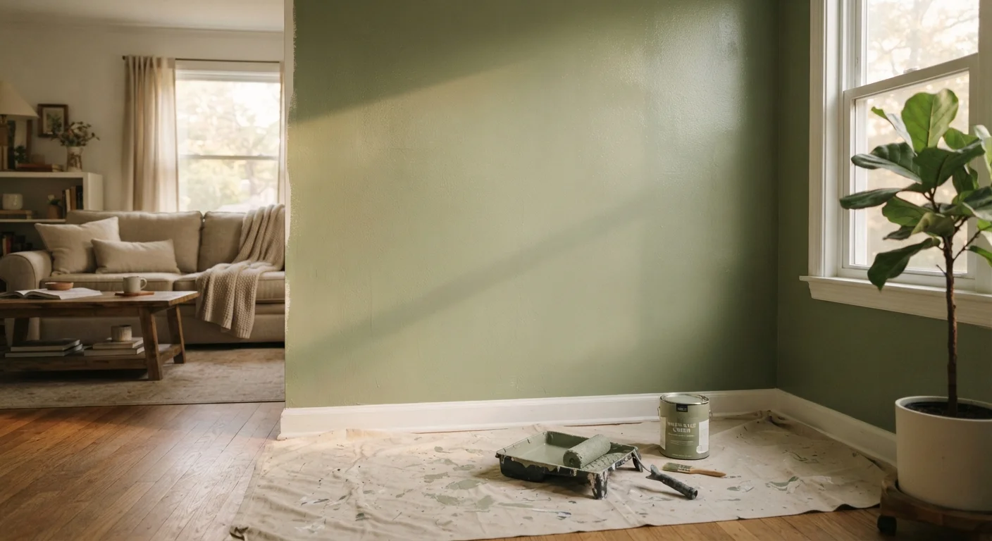
Photo: UnlockTopics.com | Unlocking Trending Content editorial
Key Takeaways
- Paint colours shift significantly depending on the direction and quality of light in a room.
- Undertones in a paint colour only become fully visible once surrounded by flooring, furniture, and trim.
- Sheen level affects how much light a wall reflects and how flaws are revealed.
- Testing a large paint swatch on the actual wall - not a chip - is the most reliable preview step.
- Full coverage across all four walls creates a colour saturation effect that small samples never show.
Why the Colour You Picked Doesn't Look Like the Colour You Got
You spent time at the store, held chips against a colour card, maybe even looked up the hex value online. Then you painted the room and immediately felt the familiar deflation: it's too blue, or too yellow, or somehow both cooler and darker than anything you imagined. This experience is so common it has become its own genre of home-project disappointment - and it's almost entirely predictable once you understand the factors involved.
Paint colour is not a fixed property. It is a relationship between pigment, light source, surface area, and everything else in the room that reflects and absorbs light alongside it. What you see on a chip is only one small part of that equation. The sections below walk through the most frequent mistakes people make when choosing paint, and what to do differently.
Judging the colour only under store lighting before buying.
Overlooking the undertone hidden within a 'neutral' paint colour.
Choosing the same sheen level throughout every room without considering the surface.
Not accounting for the 'four-wall effect' that deepens colour saturation once a room is fully painted.
Forgetting that furniture and soft furnishings will shift how the wall colour reads.
How to Build a More Reliable Colour Preview Process
The most effective change most homeowners can make is simple: slow the decision down. Rather than buying full cans based on a chip, purchase small sample pots and apply generous, properly-sized swatches directly on the walls you plan to paint. Observe them in the morning, midday, and evening - and with lights on and off.
Never Commit Based on a Paint Chip Alone
It also helps to think about colour in context rather than in isolation. Trend palettes can offer useful starting points, and understanding how colour forecasters build seasonal palettes can clarify why certain hues feel fresh or dated. But your specific room - its proportions, its light direction, its existing finishes - is the real test environment. No inspiration image or trend board can substitute for watching a colour behave in your actual space across a full day.
4-5x
Perceived colour saturation increase from chip to full room
Interior designers commonly advise clients that colour appears three to five times more saturated when applied across all four walls versus viewed as a small chip, due to the reflective accumulation effect.
~60%
Of paint colour perception attributed to lighting conditions
Colour theory research consistently identifies light - its direction, temperature, and intensity - as the dominant factor in how a painted surface is perceived in a finished interior.
Finally, give yourself permission to edit. Painting is among the most reversible home changes you can make. If a colour doesn't work, the solution is a new coat - not a permanent regret. The goal of a more careful preview process isn't perfection; it's reducing the gap between what you imagined and what you actually live with.
The content on this site is for informational purposes only and is not a substitute for professional advice. Always consult a qualified professional for guidance specific to your situation.